Why do many HMI screens make operators’ work harder instead of easier?
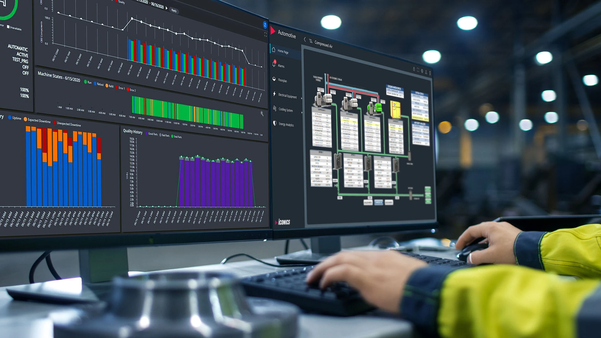
In many facilities, HMI panels are overloaded with data but lack clarity. Operators see dozens of values, alarms, and buttons, yet still struggle to quickly understand what’s happening. When a problem occurs, they have to interpret the situation under time pressure, which increases the risk of mistakes and slows down response.
The issue isn’t the amount of data — it’s how it’s presented. Without a clear structure and intuitive navigation, even the best system becomes difficult to use.
A good HMI supports the operator, not just displays data
Well-designed screens guide the operator step by step. Key information is easy to spot, alarms are clearly described, and navigation is intuitive. Instead of searching through multiple views, the operator can quickly identify the issue and take action.
Context matters too — showing related signals, machine status, and possible causes in one place significantly improves understanding.
Clarity reduces errors and reaction time
An operator-friendly HMI shortens decision time and minimizes the risk of incorrect actions. When information is presented clearly, operators can react faster and with more confidence, which directly impacts production continuity.
Poorly designed interfaces, on the other hand, lead to confusion, longer downtimes, and unnecessary stress.
Small changes, big impact
Improving HMI doesn’t always require a full redesign. Often, reorganizing screens, simplifying layouts, improving alarm messages, or adding visual cues is enough to make a noticeable difference.
At NexControl, we design HMI with the operator in mind — focusing on clarity, usability, and real-world conditions. Because a good interface doesn’t just show data — it helps people make the right decisions faster.
HMI that actually helps the operator
Good operator screens show key information without chaos and unnecessary clicks We also cover electrical schematics and control cabinets.